Bitcoin’s Technology S-Curve at close of 2022
Despite crypto winter still fits data well
This is not investment advice. Bitcoin is volatile and you should manage your risk and expectations of return.
Yearly Candles
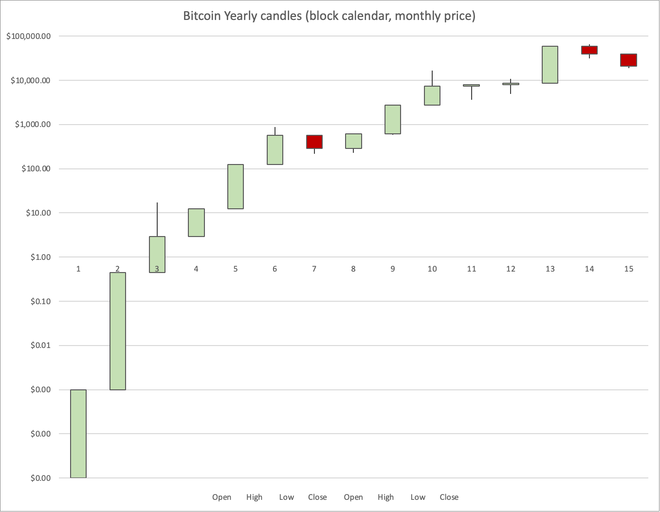
If you plot Bitcoin yearly candles the trajectory looks like the chart below. I use Block years of 52,500 blocks. In the first couple of years these ran much faster than calendar years, so we are now in year 15 (Anna Satoshi 15) on the block calendar system. And the block year now starts around the 1st of May in the Gregorian calendar. But as of the late, the two calendars have similar duration, despite the different starting point, their lengths are within a few days of one another.
More details are here:
Now what does the overall shape look like? Since this is a log-linear chart, it is not an exponential, the typical or mean annual gain decreases over time. In the first three or four years it is almost exponential because it was easy to add capital to Bitcoin at very low prices. As the price rises, it becomes more expensive relative to other assets with which it competes, including the dollar, other currencies, and gold.
Basically it looks like a power law. I call this a Lindy model for technology persistence. It’s a straight line on a log - log plot. More details are here:
Weibull S-curve
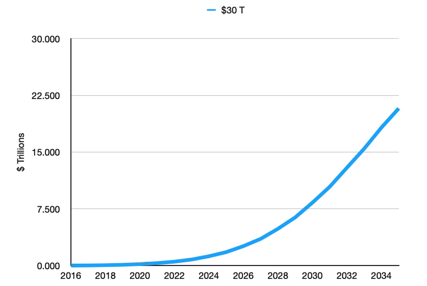
The growth also reflects technology adoption. We see a curve that is not dissimilar to other technology adoption curves, that rise rapidly for a decade or two or more before starting to saturate and then reaching levels of high adoption representing above 70% of the user population.
Now it turns out that the Weibull cumulative distribution function maps an S-curve and also looks like a power law in its early stages. The technical details and regressions from a year ago for this type of S-curve can be found here:
Here we show the details for a Weibull regression. After a double logarithmic transformation and regression, given the nature of the Weibull function, one has a chart that looks like the one below, with y representing the growth toward an assumed ultimate valuation (normalized to y=0), in this case $30 trillion for Bitcoin’s market cap. And the x-axis shows the log of time elapsed since Bitcoin started. So essentially this is a double log vs. single log chart that allows for a linear regression analysis. We are far from saturating, based on this regression. A $30 trillion market cap represents a long-term price level above $1 million for Bitcoin.
Here is an update with the latest of 151 block monthly data points beginning since Bitcoin turned age two. Despite the crypto winter of 2022, we remain well within the 95% confidence intervals for the regression and the long-term trend remains in place. The market cap at present is barely 1% of what the ultimate cap could be at $30 trillion saturation.
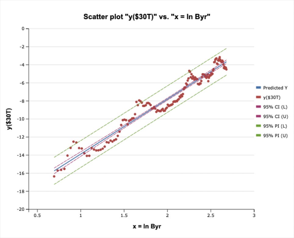
In fact it is too soon to discriminate between an ultimate market cap as small as $3 trillion or less or as large as $100 trillion (similar to global M2 or GDP); we are still too early on the adoption curve. Currently the market cap is barely one tenth of the minimal $3 trillion model examined here.
Comparison of five models for ultimate value
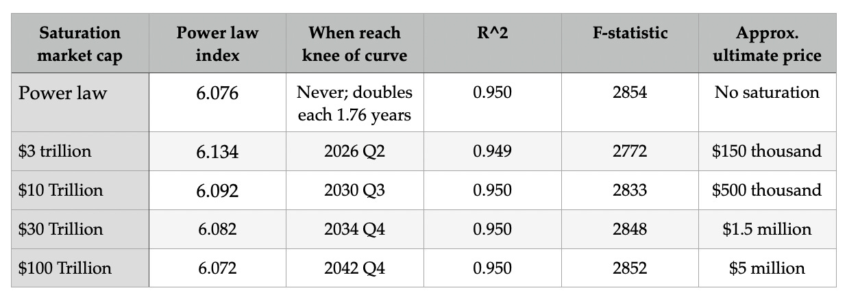
In Table 1, for the power law, and for each level of saturation for four Weibull model regressions, we show the steepness index of the (power law or ) Weibull curve and when the knee of the curve is reached. When the knee is reached the market cap of the model would be 63% of the final saturation market cap. Relative to the 2009 start for Bitcoin the adoption curve knee and flattening is reached after two or three decades, approximately. And we are almost a decade and a half in.The power law case never saturates, it goes to the sky with a doubling faster than every 2 years at present, but the doubling rate does slow over time.
The power law case never saturates, it goes to the sky with a doubling faster than every 2 years at present, but the doubling rate does slow over time.
All models have an excellent R^2 at 0.95 and high F-statistics around 2800. The best two models for the F value are the power law and the highest valuation $100 trillion model, so that is mildly encouraging. The last column gives the approximate saturation price per Bitcoin. Of course fiat will keep increasing its supply, so think of these numbers more in terms of current 2022 dollars. There wasn’t nearly as much price inflation for the period before 2020 as we now have.
Residuals skew positively (Convexity)
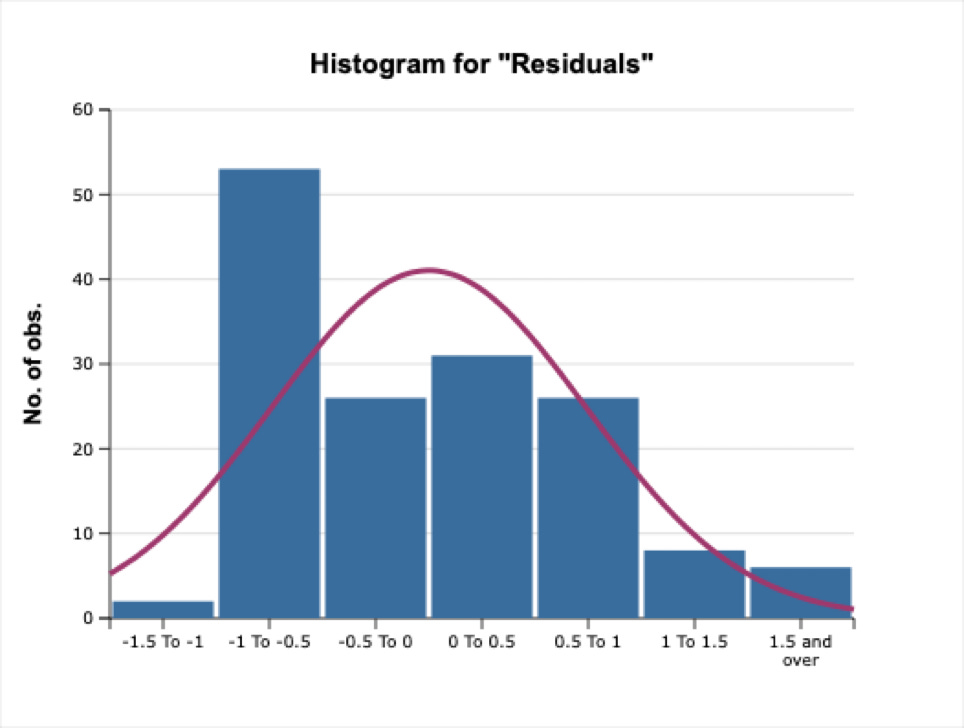
Here are the residuals, see Figure 4 below, for the $30 trillion regression. They are skewed in two ways. There are no observations below -1.5 but there are a few above +1.5. And the [-1, -0.5] interval is highly populated. Bitcoin spends more time below trend (81 data points vs. 71 monthly data points) but occasionally can spike up well above the trend. There are 14 observations in the right tail, only 2 in the left tail. The residuals for all the other cases look quite similar.
For example, for the simple power law model, the residual distribution is similar (13 right tail observations above a value of plus one vs. only 2 observations in the left tail of magnitude minus one or less).
Summary
Since our prior article in November 2021, the power law index values have decreased slightly, from the 6.11 or 6.12 in most models to currently around 6.07 to 6.09. And the timescale has stretched out for the highest value $100 trillion model, to 2042 rather than 2039. But the basic model for all cases has held up well through the crypto winter, and F-statistics have gotten even better.
Weibull S-curve models and even a simpler power law model give excellent fits to over 12 block years of data. All have similar power law indices but some have much longer characteristic growth times and much higher ultimate market caps for Bitcoin.
Winters are long, frenzied summers are short. So if you must sell, wait until the price is in the zone for the top 10% or 20% of residuals.
